Malaysian carmaker PROTON has gone through a series of logo changes since the launch of its first car in 1985. Aside from obvious changes in appearance, each logo has signified the start of a new era for the company in its development.
Every once in while a company will decide to revise its logo. Sometimes these changes occur when a business decides to alter its direction and therefore the outward image it wishes to give to people who see its logo. Other times a logo is updated to keep up with current trends and industry developments.
These changes can be subtle, such as a change of colour or font, or may be larger, like changing an entire design element. Over the years, the logo of PROTON has had its fair share of revisions, sometimes to keep in with the times, and sometimes to signify something bigger.
1985 – a Malaysian logo for a Malaysian company

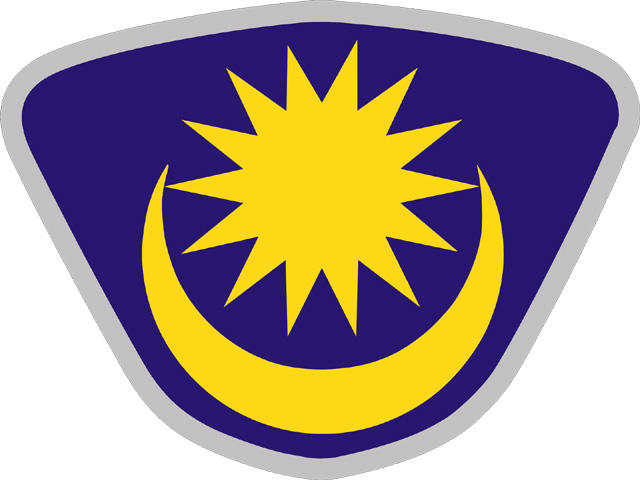
The first PROTON logo was introduced in 1985 along with its first model, the Proton Saga. If the contents of the logo look familiar, it is only because the shapes can be found next to each other on the Malaysian flag. As Malaysia’s first national car, PROTON chose to project its national pride and glory through its logo. As with the Malaysian flag, the 14-pointed star represents the unity among the 13 states in Malaysia along with the Federal Territories, the crescent symbolises the Islamic religion as the country’s official religion, while yellow is the royal colour of the Malay rulers.
Since this imagery is a national representation of Malaysia, it only made sense for the exported models to sport a slightly different logo. The domestic logo elements were replaced by an alternate take of the 14-yellow pointed star, surrounded by 14 silver five-pointed stars. This move away from its national image for the export models was essential, as non-Malaysians wouldn’t see the significance nor the appropriateness in driving a car that sports another country’s national symbol.

Proton Saga
1993
In 1993, PROTON changed the overall shape of the logo while keeping the elements intact. Models such as the Proton Iswara and Proton Wira used this version of the logo, that went together with the tagline – “Pride of the Nation”.
When PROTON reached the new millennium, they decided to commit a radical change and remove the national imagery from the logo entirely.
2000 – Enter the tiger.
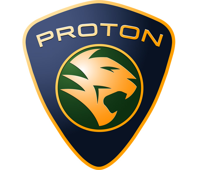
The Malayan Tiger is widely considered as the country’s national animal, just like the panda is to China. It can be seen on the Malaysian coat-of-arms, while the national football team is known as “Harimau Malaya”, with harimau being the local word for tiger. Apart from the tiger’s introduction into the logo, the word ‘PROTON’ was incorporated into it as well in bold capital letters. This new logo, introduced in the year 2000 with the Proton Waja, carries with it the tagline – “Spirit of Achievement”.
2008 – “Committed to be Better”
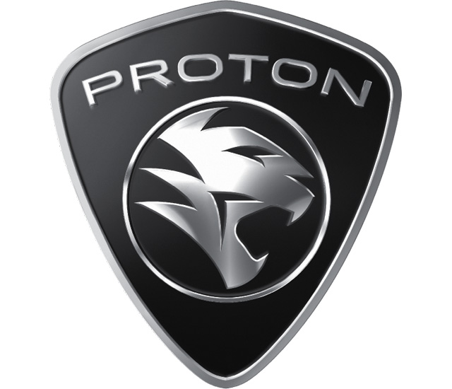
The year 2008 saw another revision in the logo, mainly on the colour scheme. Gone were the gold, blue and green as PROTON unveiled its first monochromatic logo in silver and black. The silver replaced the gold, while the entire background turned into deep black. As with all logo changes, this new logo that can be seen with the facelift Proton Saga BLM came with the tagline – “Committed to be Better”.
2016 – bigger and bolder
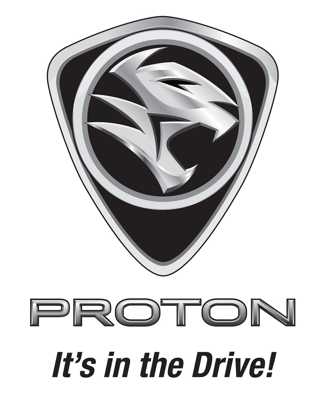
With the next logo change, the colour scheme and overall shape remains the same but the outlines were made bolder and the tiger was enlarged, with a 3D effect thrown in for good measure. These changes were made possible only because the word PROTON has been removed entirely from the shield, providing more space for the enlarged tiger. The accompanying tagline for this new logo is – “It’s in the Drive”.
2018 – a logo for the future
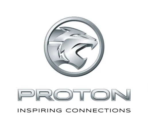
As PROTON enter the Geely era, a new logo cannot be avoided. More than two years after the partnership was forged between PROTON and Geely, a new logo was finally introduced. The shield has been removed, leaving only the circle that encases the tiger. The animal itself was given a makeover and its jaws are now facing forward rather than downward. This fierce new logo fits perfectly in this new era of connectivity with the tagline “Inspiring Connections”.


