

Over the past three decades, Geely has used a multitude of logos. Let’s take a closer look at the story behind each logo and why these updates were made.
In Chinese, the name Geely(Jílì) means auspicious or good fortune and it’s common to wish for Geely in life or in business. Geely’s founder, Li Shufu chose the name Geely when starting his business in the hope that the company would experience smooth and auspicious development. Also related to good fortune and auspiciousness in Chinese culture is the number six, as the word for six in Chinese (liù) sounds like the word smooth. There is also a common idiom of liùliù dà shùn which translates to hoping “everything will go smoothly.”
Young Li Shufu at Geely HQ
As a young entrepreneur, Geely founder Li Shufu had great aspirations and lofty dreams, so in wishing for a smooth journey and hoping customers would also share in his good fortune, he aptly named his new venture Geely and designed a logo symbolizing good fortune.

Original Red Geely Logo

Original Geely HQ in Taizhou with Red Geely Logo
The very first Geely logo looks like the silhouette of a red mountain, reminiscent of those found around the original hometown of Geely in Taizhou, Zhejiang Province. The mountain symbolizes the solid foundation of Geely and its people. Six slanted lines forming the slope of the mountain represent the hope that those in Geely would grow step by step until reaching the height of industry. But how does this mountain shape relate to good fortune?
What looks like a mountain is actually created by a pattern of six sixes (666666), a reference to the famed idiom liùliù dà shùn which perfectly matches with the name Geely and its hope that all things will go well and all people associated with Geely will enjoy good fortune. From the very beginning when Geely was incorporated in the early 1990s, this red mountain of sixes was the logo of the company.

Six Sixes Inspiration for Geely Logo
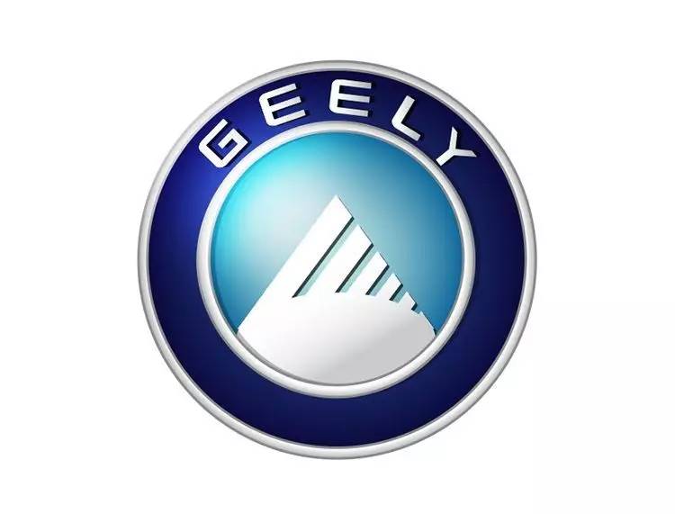
In 1997, Geely entered the automotive industry, a milestone which represented a significant step in the company’s evolution. In acknowledgement of this moment, Geely’s logo evolved to become white in a sky-blue background and was circled by the company’s global name Geely. The inner sky-blue background symbolized the vast blue sky and infinite possibilities of the company. The outer blue circle symbolized that which lies beyond infinity and the universe. Finally, in using its global name “Geely”, the company showed its determination to be a global enterprise.
This ambitious logo would be seen on Geely Auto’s vehicles including its first generation models from 1998 to 2007. From 2007 to 2013, Geely Auto’s second-generation models began to use their own sub-brand’s logos while Geely’s corporate brand and global entity continued with the white mountain and sky blue logo.
Second Blue Sky Geely Logo
Geely Holding Group Corporate Logo
In 2011, Geely Holding Group began to distinguish itself as a successful steward of global brands. Setting itself apart from its automotive subsidiary brands, the Group began using the standalone text “Geely” taken from the previous white mountain and blue-sky logo.
In 2013, Geely Auto also reached a new milestone in its development with the brand’s entry into its third generation of vehicles, the “Making Refined Cars for Everyone” era. In this third era, Geely Auto recombined its sub-brands into one Geely brand and began using a new logo, a gold-rimmed, six segment shield logo most familiar with consumers today. The shield shape is a testament to Geely Auto’s commitment to safety. Making up the internal section of the shield are black and blue colored segments which represent the earth and sky showing the brand’s hope of seeing its products traveling around the world and its ambition to reach for the skies. The gold accented outer trim is homage to the brand’s “refined” vehicles era.
Refined Cars 3.0 Era Geely Auto Brand Logo
Today, the logos of Geely Holding Group and its main automotive subsidiary Geely Auto Group have only changed slightly. Geely Holding’s blue Geely logo was recently updated to a more technical grey to symbolize the transformation of the corporate entity into a global mobility technology group. Geely Auto’s logo became sharper and took on a silver trim to symbolize the brand’s entry into its fourth era of development, the “Innovative Geely 4.0” era, with advanced products based on its new modular vehicle architectures and next-generation technologies.

2021 Updated Geely Holding Group Corporate Logo

Updated “Innovative Geely 4.0” Geely Auto Logo
With all the changes over the years, Geely has always maintained its original intent in its logos. An auspicious name combined with the lucky number six to produce imagery both rich in culture and meaning. The wish and hope of Geely’s founder Li Shufu for the company’s continued success and for Geely’s customers and partners to share in its good fortune continue to emanate from the company’s different logos.